
Supply Risk Assessment
Supplier Risk Assessment System in Use
As companies increasingly adopt global sourcing and supply chain management practices, they are discovering both opportunities and challenges. On the one hand, global sourcing is lowering purchase prices and expanding market access. On the other hand, operating a global distribution channel increases the level of supply chain risk with an increase both in the potential for product and service disruptions and in the magnitude of those disruptions.
According to Aberdeen Research, more than 80% of supply management executives reported that their companies experienced supply disruptions within the past 24 months and these supply glitches negatively impacted their companies’ customer relations, earnings, time to-market cycles, sales, and overall brand perceptions. They also found that less than half of enterprises have established metrics and procedures for assessing and managing supply risks. and many procurement organizations lack sufficient market intelligence, skills, and information systems to effectively predict and mitigate supply risks.
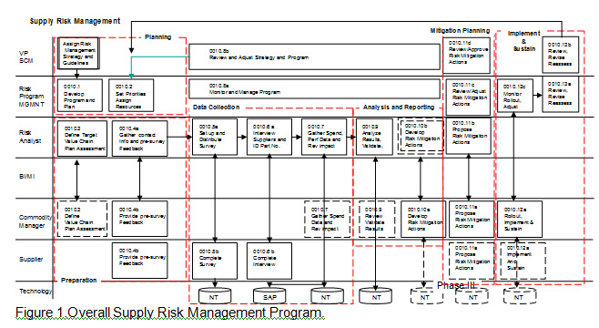
In response to this, Supply Chain Redesign L.L.C., a consulting firm focused on supply chain management, has created a framework and process to better understand the drivers that create supply disruptions and mitigate the risk more proactively. This framework and process consists of a set of disruption predicators developed through several years of research and experience with global supply chains. The process and framework has been used by Risk Management teams and commodity managers to aid in identifying, predicting and managing risk on a timely basis or to be alerted to possible risk factors that require their attention.
The primary reporting view of the system is the “risk wheel”. The diagnostic view is shown in Figure 1. This view is available for any demographic and any level of drill down. The center of the wheel is the Risk Index for the demographic (supplier, sub category, commodity, etc.). In the second ring are the risk categories and the outer, the risk indicators. Each item is color coded. Red (high risk), Light Red (medium risk), Yellow (low risk), green (no risk). A description of each element of the wheel becomes visible as the curser touches the area and the details are available by “clicking” on the section of interest. This report can be used to understanding the base factors about the supplier that are driving risk.
Figure 2 is the Risk Wheel for the analytical or risk event mode. This view takes into account the indicator scores by applying them to potential risk events that would result in a supply chain disruption. The events are assigned a probability of occurrence within a specific supply chain by experts within that supply chain. This probability is multiplied by the risk indicator score for that event. The averages of the results are rolled up to produce the Risk Probability Index (RPI). This is a relative measure used to rank order the suppliers according to the potential of a supply chain disruption.
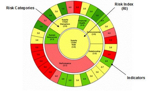
Figure 1. Risk Wheel – Diagnostic
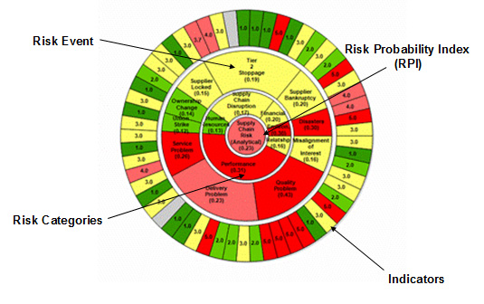
Figure 2. Risk Wheel – Analytical
The Multi-Use Matrix (MUM) Chart Report, Figure 3, is used to show the Risk Category Scores for all (or some since the number of suppliers is selectable) of the suppliers in a commodity group. It is also color coded to indicate high to no risk scores. This report is useful in comparing suppliers within a group by risk category. The suppliers can also be rank ordered using this report.
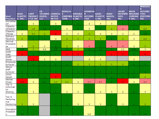
Figure 3. MUM Chart
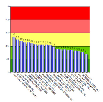
Figure 4. Bar Chart Ranking Report
The Bar Chart Report shown in Figure 4 is used to show the ranking of each supplier’s Risk scores within a commodity group.
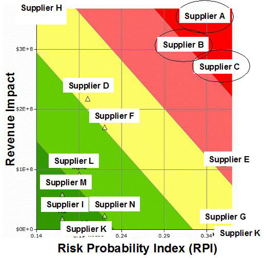
Figure 5. Risk Distribution Matrix
The Risk Distribution Matrix shown in Figure 5, is constructed by plotting the Revenue at Risk (Rev Impact) with a supplier v. the average Risk Probability Index (RPI) of that supplier. It is used to view all the suppliers within a commodity group placed within a 2 by 2 matrix according to their risk and potential impact on your company. The zones are color coded from Red (high risk) to Green (no Risk). This is a visual sorting mechanism used to help prioritize and focus mitigation actions on the high risk suppliers. Many other reports and views are available with this system.
The assessment process covered in this document consists of the preparation, data collection, analysis and reporting portion of an overall Risk Management Program being implemented by several companies and shown in Figure 1.
The purpose of this section is to explain the assessment process activities, steps and methods. Contained in this section will also be the model logic, assessment measures, templates and key reports.
Data Model
Overview and Logic
The risk assessment model measures the risk associated characteristics of a company’s supply chain based upon several dimensions (shown in Figure 2).
The six categories of risk in a supply network are:
Supply Chain Disruption
- Performance
- Human Resources
- Environmental Risk
- Relationship
- Financial Health
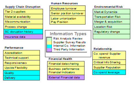
Figure 2. Types and Sources of Supply Risk Assessment Information
This assessment is very comprehensive and uses several data sources for a 360 degree view of supply risk. The data on these categories are gathered from several sources; from the suppliers themselves through a web based survey, from internal company information sources, and from external information sources.
After collection, the data are then organized into six Risk Categories, shown in Figure 3, representing the different sources of potential supply chain risk.
Supply Chain Risk Categories (attributes)
These are measuring the attributes of the Supply Chain Network servicing the company under review. The risk score indicates the potential of risk events occurring within the supply chain network or external events negatively impacting the supply chain. The higher the score, the more ‘risk’ is within the supply chain network.
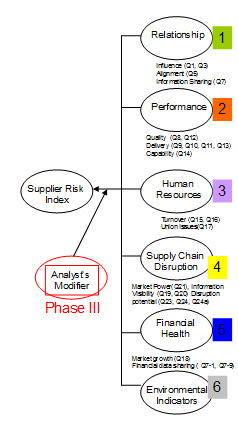
Figure 3. Risk Categories
Viewing the data by risk categories provides a diagnostic view of the supply network and aids in identifying the attributes that are driving the risk rating and targeting mitigation actions.
The data are also organized by Risk Event, shown in Figure 4. These are the events that might occur that would result in a supply chain disruption.
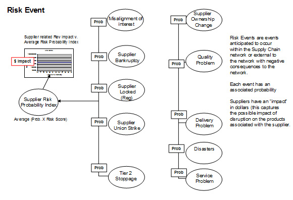
Figure 4. Risk Events
Viewing the data by risk events provides an analytical view of the supply network and aids in identifying the attributes that are driving the possibility of specific events. This helps in understanding “what” might happen that would result in a supply disruption.
After the assessment data is applied to the Risk Events, they are then organized by Risk Category, as shown in Figure 5.
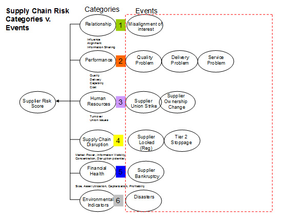
Figure 5. Risk Events organized by Categories
Viewing the data by risk events that relate to risk category provides an analytical view of the supply network that in identifying the sources of risk that are driving the possibility of specific events. This helps in targeting mitigation actions to specific sources of risk in a supplier rather than broad supplier development programs.
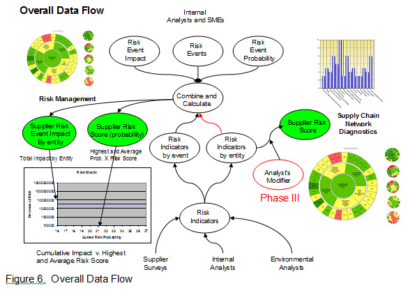
The risk measurements, or indices, are calculated in two paths: Diagnostic and Analytical.
Path one, the Diagnostic, is a simple roll up of assessment scores (indicators) into the respective risk categories. A Risk Index is then created by averaging all the scores. This Risk Index reflects the comparative level of risk in the supply chain as it is constructed and managed at the time of the assessment. This measure is used to build a ranking of suppliers and commodity groups in order to determine acceptable levels of risk in the structure of the network itself.
Path two, the analytical mode, is slightly more complex. The assessment scores (indicators) are rearranged according to Risk Event. A score is assigned to each event based upon the summed actual indicator scores divided by the total possible score.
Each risk event has a probability representing the likelihood of that event occurring in a certain product category. These are developed by expert sources within the company that are knowledgeable in the specific supply chain being assessed. The probabilities for each event are then multiplied by the event score producing a Risk Probability Index (RPI). The average RPI for all events is then calculated. This number represents the event associated risk potential of a disruption for the supplier assessed. Figure 6 shows the overall, two path data flow.
Key Reports
The primary reporting view of the system is the “risk wheel”. The diagnostic view is shown in Figure 7A. This view is available for any demographic and any level of drill down. The center of the wheel is the Risk Index for the demographic (supplier, sub category, commodity, etc.). In the second ring are the risk categories and the outer, the risk indicators. Each item is color coded. Red (high risk), Light Red (medium risk), Yellow (low risk), green (no risk). A description of each element of the wheel becomes visible as the curser touches the area and the details are available by “clicking” on the section of interest. This report can be used to understanding the base factors about the supplier that are driving risk.
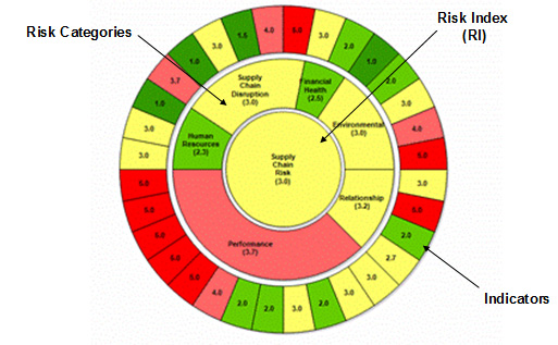
Figure 7A. The Risk Wheel – Diagnostic
Figure 7B is the Risk Wheel for the analytical or risk event mode. This view takes into account the indicator scores by applying them to potential risk events that would result in a supply chain disruption. The events are assigned a probability of occurrence within a specific supply chain by experts within that supply chain. This probability is multiplied by the risk indicator score for that event. The averages of the results are rolled up to produce the Risk Probability Index (RPI). This is a relative measure used to rank order the suppliers according to the potential of a supply chain disruption.
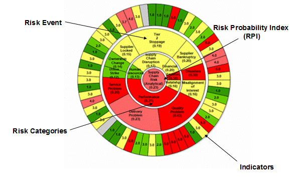
Figure 7B. The Risk Wheel Analytical (Events)
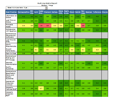
Figure 8. The MUM Chart Report
The Multi-Use Matrix (MUM) Chart Report is used to show the Risk Category Scores for all (or some since the number of suppliers is selectable) of the suppliers in a commodity group. It is also color coded to indicate high to no risk scores. This report is useful in comparing suppliers within a group by risk category. The suppliers can also be rank ordered using this report.
The Bar Chart Report shown in Figure 9 is used to show the ranking of each supplier’s Risk scores within a commodity group.
Figure 9. Risk Bar Chart Report
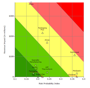
Figure 10. The Risk Distribution Matrix
The Risk Distribution Matrix shown in Figure 10, is constructed by plotting the Revenue at Risk (Rev Impact) with a supplier v. the average Risk Probability Index (RPI) of that supplier. It is used to view all the suppliers within a commodity group placed within a 2 by 2 matrix according to their risk and potential impact on the company. The quadrants are color coded from Red (high risk) to Green (no Risk). This is a visual sorting mechanism used to help prioritize and focus mitigation actions on the high risk suppliers. Figure 10A shows the revenue impact calculation method.

Figure 10A. Revenue Impact Calculation
Other reports are available by downloading a data file and building a report using Excel and additional data concerning the supplier or mitigation actions. Figure 11 is a typical example of this type of report.
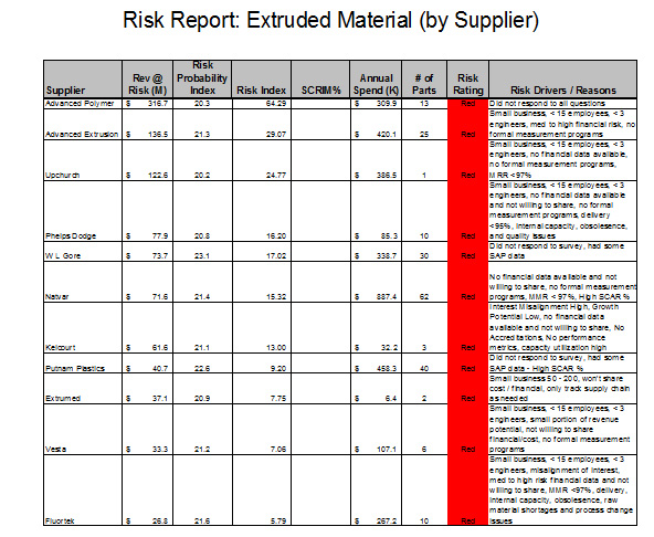
Figure 11. Supplier Risk Report with Risk Reasons and Spend